This lab is an introduction to contouring. The goal is to learn how to interpret a contour plot, and how to create one.
We first examine a sample contour plot.
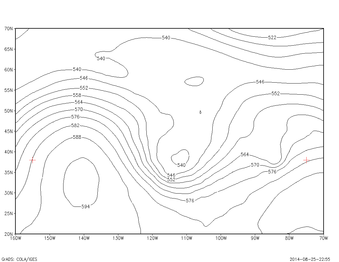
We examine the line connecting the two red markers on the plot. A ruler is used to draw a line connecting each mark. The ruler is then used to mark half-inch intervals along the line. A value of the function f(x,y) is determined at each of these marks, by examining the contour field, and subjectively interpolating between the contour lines as necessary.
A graph is then made of these values. Below is a computer rendering of the graph:
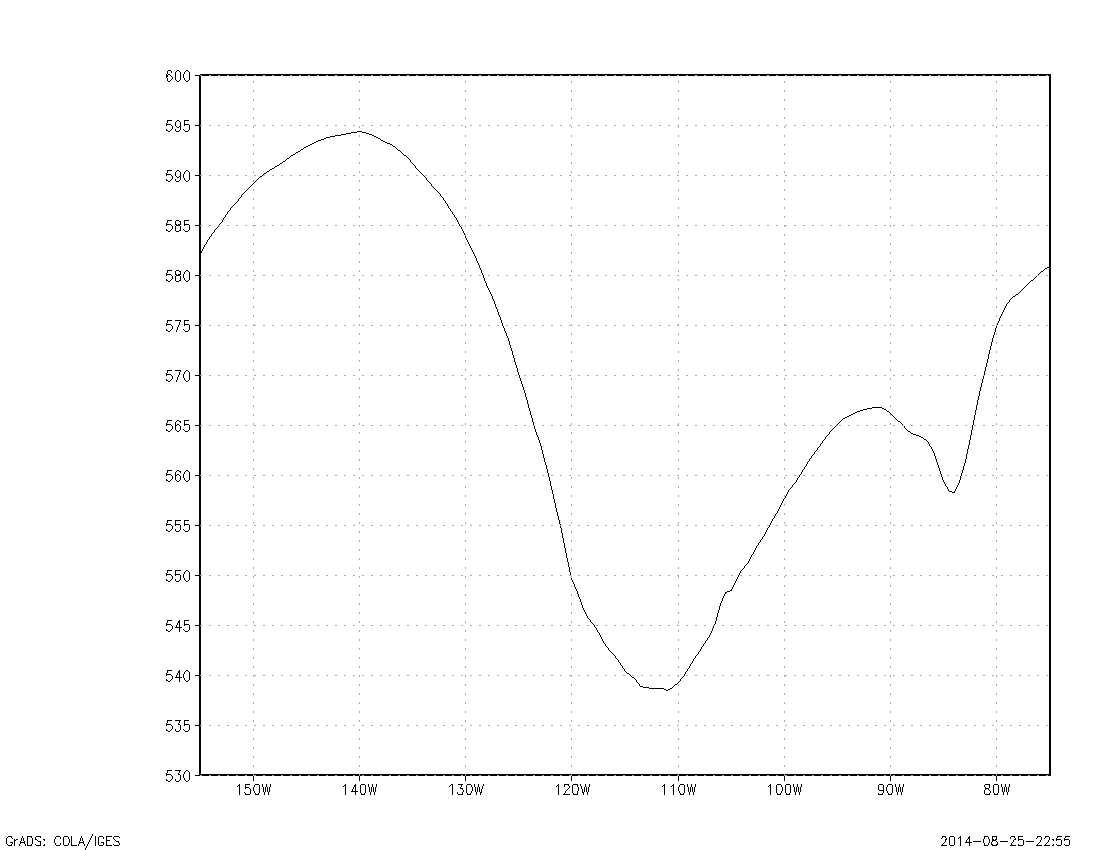
We note that places where the curve has high slope are locations on the original contour plot where the contours are more tightly packed. We also note that a tangent slope at a point on the graph is an estimate of the partial derivative of the function f(x,y) with respect to x.
The tangent line discussed above is the tangent line to the function f(x,y) in a specific direction: the direction where x is varying and y is fixed. We also want to look at the maximum slope of a line drawn tangent to the function of two variables f(x,y) at a point, where we allow both x and y to vary as needed. This tangent will be a vector that is perpendicular to the contour lines at that point. In meteorology we call this the gradient.
When looking at a contour plot of some specific meteorological variable, the magnitude (strength) of the gradient can be estimated by spacing of the contour lines. The regions where the contour lines are closely spaced (ie, where there is a strong gradient) are usually of great interest to the forecaster.
We will begin learning how to draw contours by considering functions of two variables f(x,y) that can be described with fairly simple algebra. Let f(x,y)=x2+y2. This is a function defined over all ranges of x and y. For example, f(2,3)=13. We can find the equation for a specific contour level c by letting f(x,y)=c. So to draw a contour line at a value of 9, we get the curve x2+y2=9. This is the equation for a circle with the center at (0,0) and a radius of 3. This will be our contour line with a value of 9.
Most functions are more complex. A general way to draw contour lines is to determine the values of f(x,y) at regular intervals of x and y, creating a grid of values. The location of a contour line can then be approximated by drawing it at or between the appropriate grid values. For example, if two adjecent grid values are 5 and 15, the contour line with a value of 10 would go halfway between them.
It is often useful to look at the function f(x,y) at some fixed value of x or some fixed value of y. In this case, we get a single curve. For the example f(x,y)=x2-y2, if we look at the function with x varying and y fixed at the value of 4, we get the curve described by: f(x,4)=x2-16. This is a parabola.
A grid of values of this function is provided below:
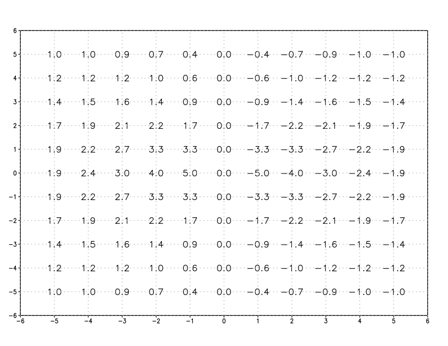
2) Create a contour plot of the function f(x,y)=5·sin(x/2)·cos(y) over a range of x and y from -5 to 5. (Assume x and y are radians.) Use a contour interval of 1. Label each contour line with its value. Also plot (on a separate graph) the curve where y is fixed at 3 and x ranges from -5 to 5.
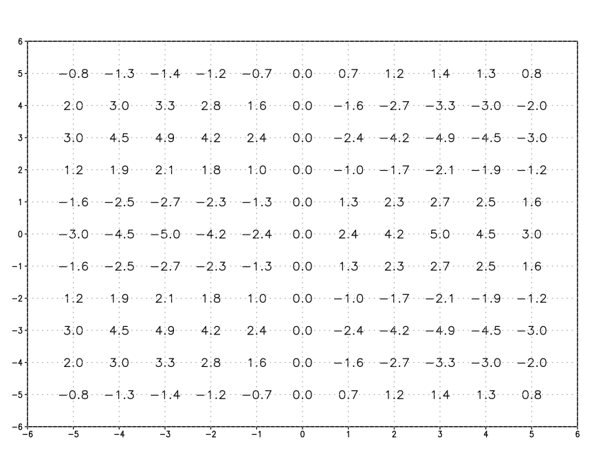
A grid of values of this function is provided below:
3) The next section of the lab covers how to create a contour plot, given a field of regularly-spaced points that sample the function f(x,y). In this case, f(x,y) cannot be described by a simple formula.
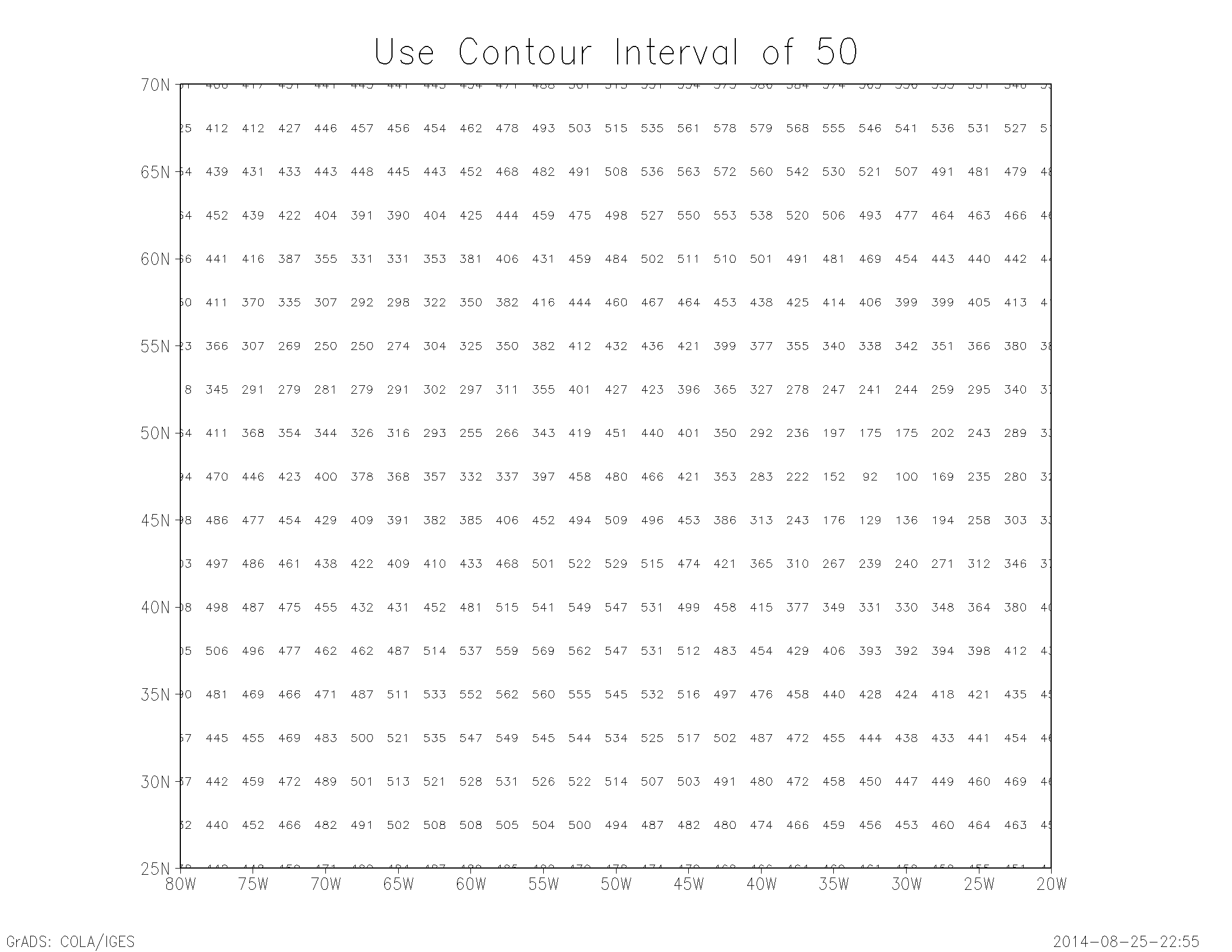
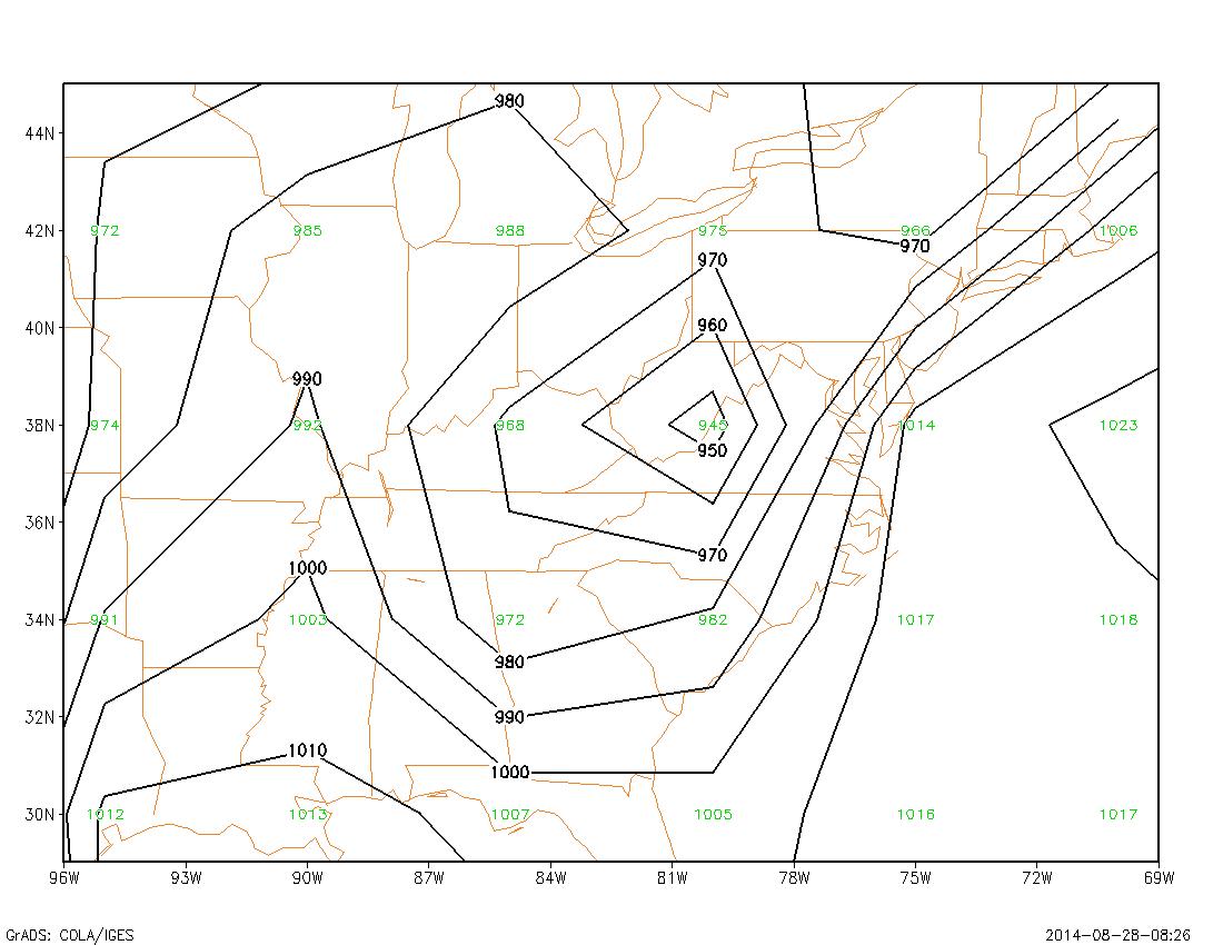
Draw contour lines of f(x,y) described by the following grid of values. Use a contour interval of 50 (ie, use 0, 50, 100, 150, 200, 250, 300, etc). Each number is centered at the location of the value. Note that the following grid is taken from a weather map:
The contour plot is constructed one contour line at a time, where each line repreents a constant value of f(x,y) along the entire line. A contour plot normally consists of contour lines drawn at some equal integer interval.
Each contour line is constructed with adherence to the following rules:
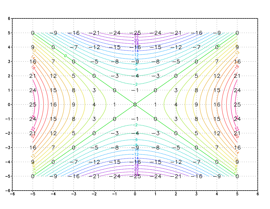
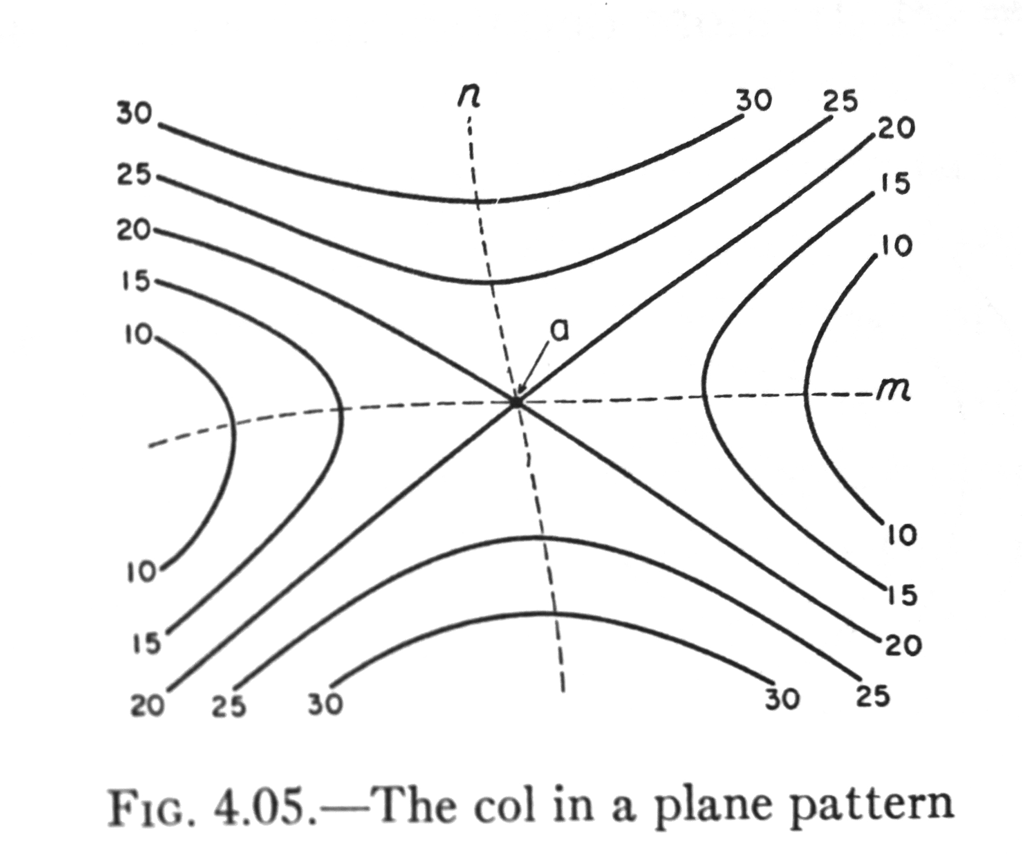
The saddle point, or col point is a location where contour lines of the same value may get very close, or even meet. An example of this is shown below:
Here is an example (taken from the lab exercise) of a grid of points:
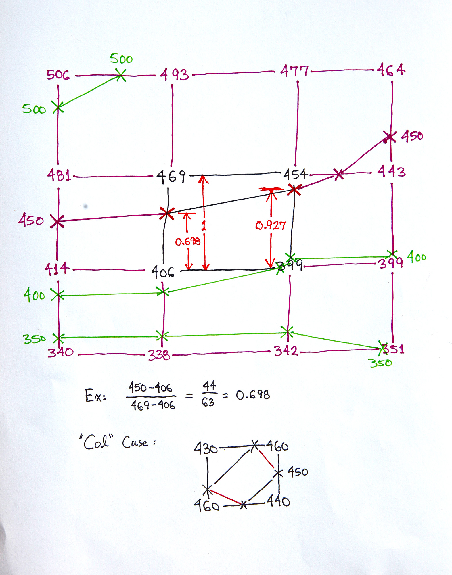
This is a sketch that allows us to discuss a computer algorithm for constructing contour lines within the grid.
We first have an outside loop that loops through each contour level. We then have a loop that examines each grid box one at a time. A grid box has a data value at each corner.
Consider the center grid box in the above sketch, drawn in black. There are four sides to the box. Two of the sides are horizontal, and two are vertical. Each side has two data values. For each side of the box, we compare these two data values with our contour line value, to see if the contour line passes through that side of the box.
For example, if we are drawing the 450 contour line, and examining the vertical side on the left (we are discussing the center box), we do the following logical test:
Is 469 greater than 450 and is 406 less than 450
----or----
is 469 less than 450 and is 406 greater than 450
If this logical test is true, then the contour line intersects our box side. We then use linear interpolation to determine just where this intersection is (this calculation is shown on the above sketch, below the grid).
If the contour line intersects one side of the box, it must intersect another side.
So we test each side in turn, to find the other intersection point. Once we have both points, we can draw a line that connects each point, and move on to the next box.
Note that a col point may have a contour line of the same value pass through all four sides! This allows for two possible ways of drawing the contour line segments. See the bottom of the above sketch for an example of this situation (this col example is a grid box not seen in the lab exercise). A "shortest path" test can be used to choose between the two possibilities.
In the sketch above, the other contour line segments that would be drawn for the 450 contour line are shown in purple, and the line segments that would be drawn for the other contour levels are shown in green.
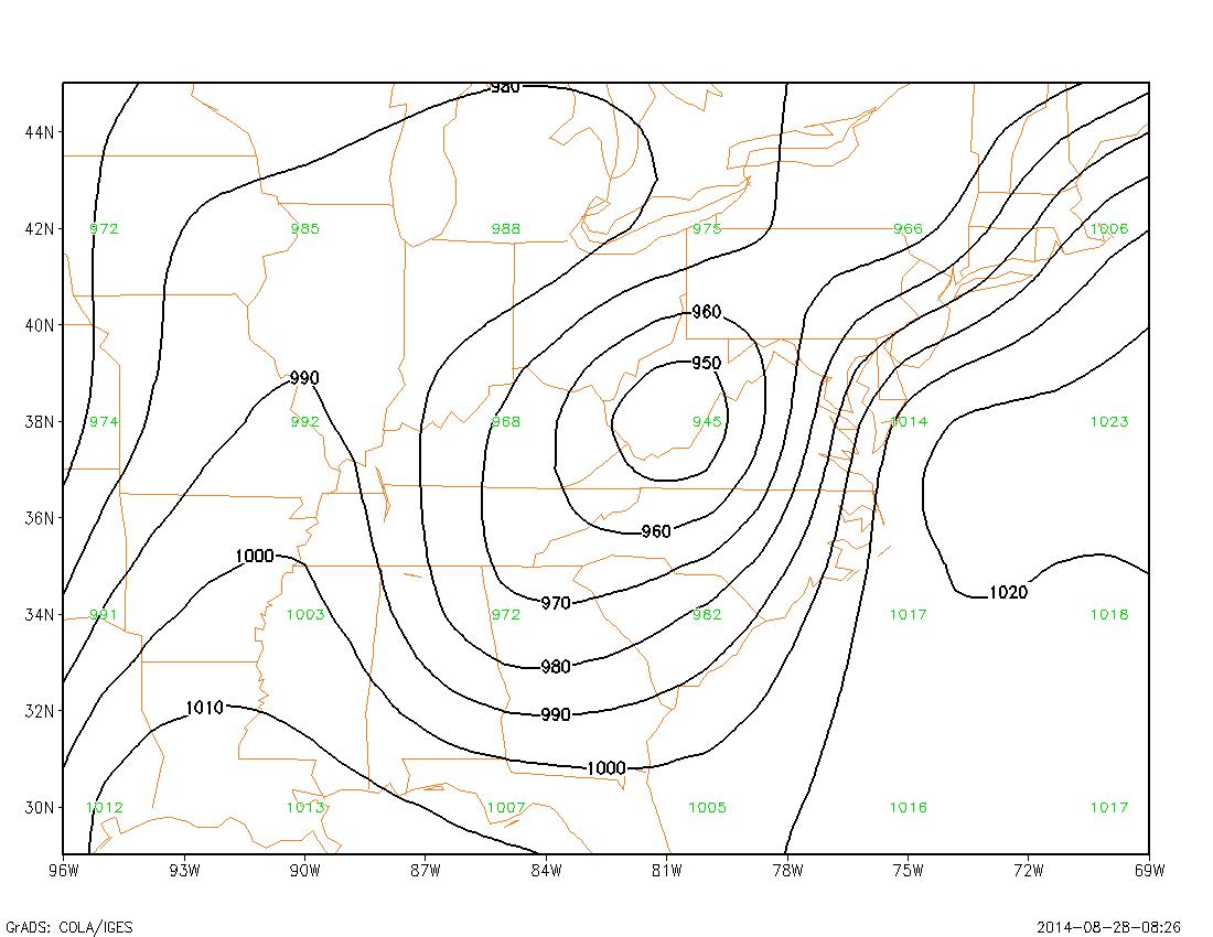
Here is an example of a contour plot done using this technique, with the grid point values shown in green:
In practice, somewhat more complex algorithms are used, where the line is "followed" to obtain a sequence of ordered points along the line. This allows the line to be more easily labeled, and it allows for various smoothing operations to be done, such as a spline fit.
This is a smoothed version of the previous plot: